Underestimating the importance of the footer is a common mistake
If you think that the header of a website and the Zendesk knowledge base is more important than the footer, then we are sorry to say, but you are wrong. They are equally crucial despite a common misconception that nobody (or just a few) use a footer. We have prepared several compelling reasons to convince you to work on your Zendesk Guide footer.
It would be odd and even suspicious to see a branded shiny header and a footer that is non-branded and non-consistent with the main website on your Zendesk knowledge base.
-
Smart navigation and additional information
A resourceful Zendesk footer can lead users to delve deeper into the website and learn more about your business. It may also be treated as a concise version of the sitemap, which improves navigation. Providing links to the main areas of the website can improve users’ experience (especially mobile users) since there is no need to scroll up to the header to access them. And even if you have a dynamic header, it’s not recommended to overload it with plenty of information. The space available at the bottom is another beauty allowing you to use it to your advantage.
The links in the footer can serve you a great deal as many search engines favor them. Hence, the ratings of your main website, along with your Zendesk Guide, can be higher in search results.
The bare minimum and additional elements for your Zendesk Guide footer
The following list of elements is sorted from most important and vital, down to the extras:
-
Copyright, terms of service and privacy policy
Terms of service, along with a copyright notice and privacy policy, are legal documents that keep your business secure.
Since it’s one of the most sought-after elements in the footer, it would be a great idea to show the preferred methods of contact right there instead of placing a link leading to the contact details page.
It states an official correlation of the Zendesk knowledge base to your main website.
This one can be called a “rescue” element for visitors who have reached the end of the page and most probably haven't found what they were looking for.
This can include an ‘About the company’ page or ‘Careers’ page depending on your demands.
If you have partners’ or customers’ accounts, then a link to login is a crucial element.
-
Social media icons or widgets
Not so many marketers recommend including the links to social media in the header to prevent visitors from leaving right away. Therefore, locating the icons or widgets in the Zendesk footer will do both – keep your social media communities active (since you will still provide the links across your internet resources) and prioritize the information listed on the Zendesk Guide.
A footer is a perfect place for making your call-to-action or adding a final compelling argument for visitors to stay with you.
Sometimes this is the very last chance to contact your visitors before they leave. Offering them to sign up and leave their email address in the footer has two pros. The first – you expand your customer database and the second – you do that with respect to people and unobtrusively, meaning without annoying pop-ups and dynamic windows that chase people.
Depending on your business niche, you can show the latest articles in the footer as well. Furthermore, the articles are a hub for keywords to rank high in search engine results.
An approximate percentage of journalists and editors visiting your website starts from 1%, and this number varies in accordance with your popularity and business niche as a whole.
-
Company’s mission and values
Sometimes you need the last drop to convince visitors to choose you. Openly demonstrating your mission and values might help win a new customer.
-
Awards, certificates, and testimonials
These are your trump cards in your sales package, differentiating your business in the market, and adding credibility to your internet resources. So, it would be wise to use them to your advantage.
If you run a lot of events or have an important event coming up, it’s a great idea to add information about it into the footer to increase the coverage of potential visitors.
Examples of great Zendesk footers
It’s certainly better to see examples with your own eyes to form your ideas and vision than to read countless of articles around this topic.
FullStory
The Zendesk knowledge base footer of FullStory features an excellent and convenient structure, a lot of useful content, social media icons, and, most importantly, it duplicates the footer of the main website.

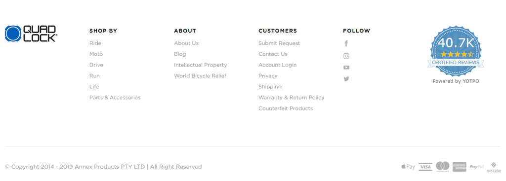
Quad Lock
This spacious footer is quite harmonious and effective as it grabs attention with an impressive badge and contains the most important elements, such as the great structure of key areas of the product usage, shares information about the company, and useful links to the pages for the customers. It also displays the social media icons, and, of course, it’s 100% identical to the footer of the main website.
Furthermore, considering that it’s an e-commerce site, Quad Lock shows the methods of payment available in the footer since they are convenience benefits for the customers.
Avocado
This example of Zen-like footer demonstrates the simplicity and power of messages addressed to people. Surprisingly it doesn’t contain the menu or any other areas except social media and a support link. However, this executive decision allows people to focus on what’s important and read the message without any distractions. The company put the stakes on social responsibility.

Final recommendations
It’s essential to keep the footer on your Zendesk Guide organized and adhere to the main principles: show a corporate correlation to the brand, be helpful to the users, give them a reason or two to choose you, and be optimized for search engines.
You can go ahead and try improving your footer within the scope of your resources, or you can also contact Lotus Themes and have them code and customize every single element of your Zendesk Guide footer.