Different view for different kinds of displays
Websites with responsive design change the location of their elements depending on the device on which the user chooses to view the website — a desktop, a tablet or a smartphone.
Responsive design has recently become of primary importance. More and more users choose to use mobiles for Internet access. According to research, already smartphones and tablets account for 66% of the time on the Internet. Moreover, if the website is not responsive for such devices, 61% of users leave it immediately. The only way to not lose those potential customers is to have a smartphone and tablet responsive website.
Make your Help Center convenient for your customers. It’s so simple!
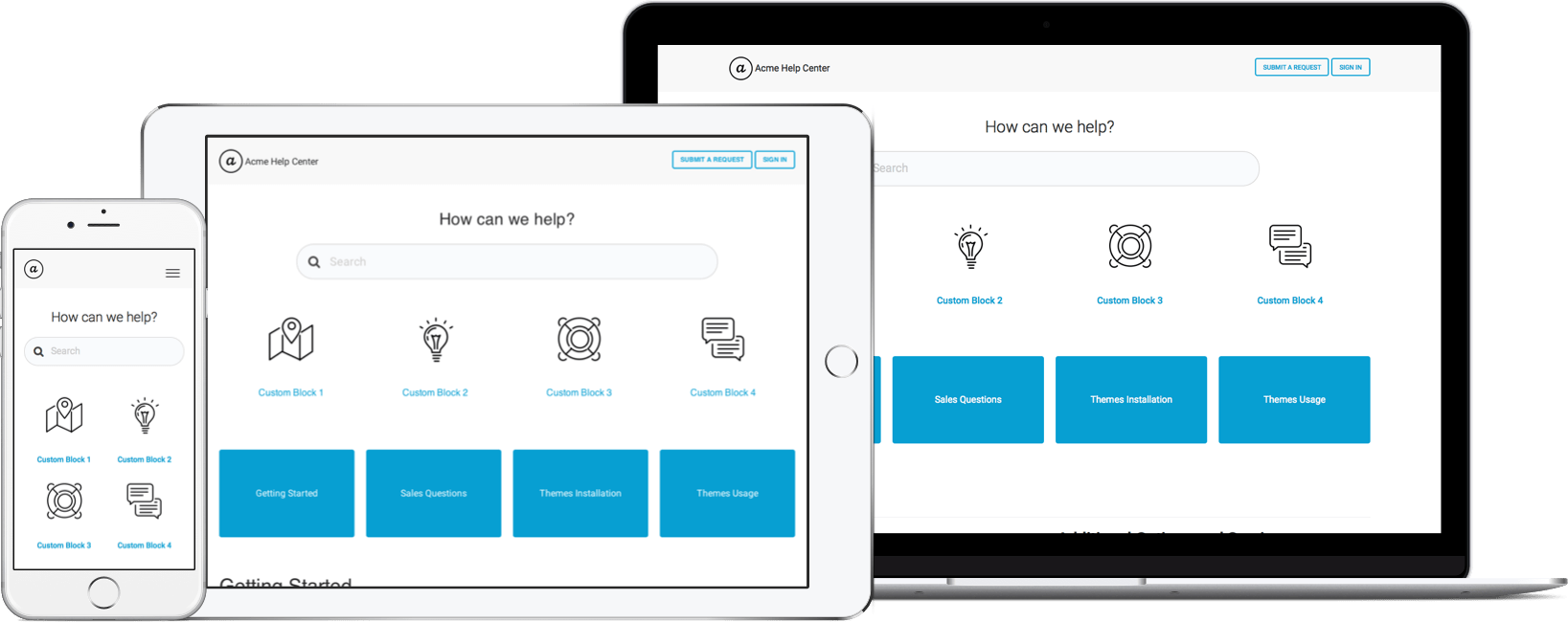
Each page layout is different for different kinds of displays
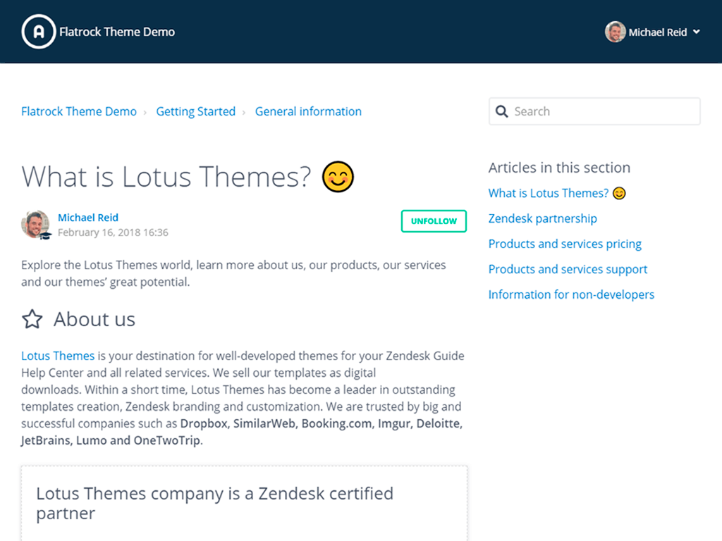
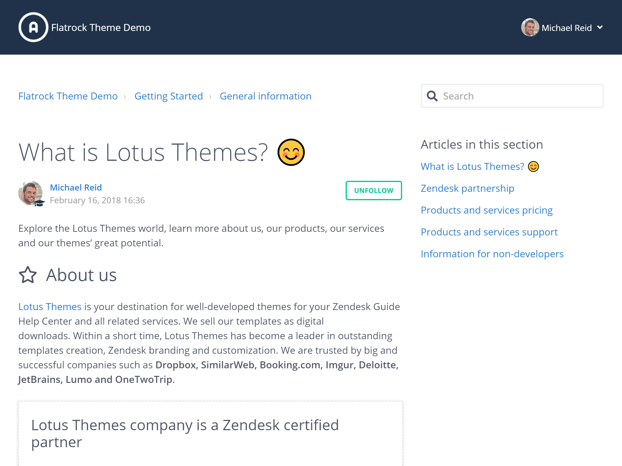
Compatibility with Retina-displays
More and more modern computers are equipped with Retina displays. These displays have such high definition that the pixels cannot be seen with the naked eye.
To make your site look good on such displays you need to refine it.
By default, our Zendesk Responsive templates are compatible with Retina-displays. Customers will have a very positive experience from using your Zendesk Help Center.
This is how users see details on Retina displays
Non-retina ready theme
Retina-ready theme
Google prefers the sites with responsive design
Since 2015, within the scope of the quality development program of their search capability, Google has been giving a lower ranking to sites which don't support mobile devices.
If most of your traffic comes through your Help center, then it is the primary goal for your business to make it mobile responsive.
Even if the users move to your Zendesk Help Center from the search line and come to a non-responsive site, most likely they will close the window and choose another site.
Our themes make your Help center responsive in just a few minutes!
Take care of your customers
Responsive design first of all demonstrates your positive attitude towards your customers. Your user friendly site signals its top quality and shows your customers that you pay attention to details.
Take care of your customers and they will appreciate it!